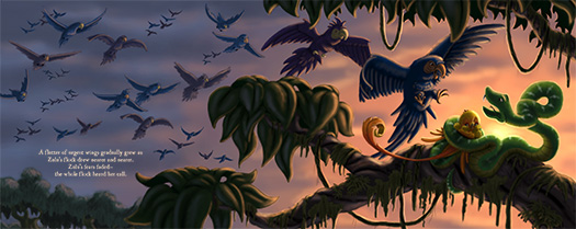
So instead here are a few comparison images. First is the final painting. I usually go in and correct value problems, painting blemishes, color problems and anything else that I didn't do well in the actual painting. I'm starting to try and avoid all that because it's kind of a crutch. Plus it doesn't always look the best. I shouldn't depend on Photoshop to fix my mistakes! So I spent a little extra time on this painting to make sure it was the best I could make it. I admit this image is Photoshopped a bit. But only to brighten the image a little from the scan and boost the colors slightly to make it pop!
Here is the grayscale version of the painting to check values.
Here's the digital color sketch to compare to the final painting.
And a close up shot of the focal point to see some details.
That's it! I'm already onto the next painting. I will be posting that one soon as well so come back to visit often!


No comments:
Post a Comment